Showing posts with label Prints. Show all posts

Friday, January 28, 2011

b Store loves Liberty


Both of us at Style Salvage have a soft spot for this particular homely department store and the fabric it is famous for. In 1875 Sir Arthur Lasenby Liberty opened his first shop on Regent Street with merely three employees, where he sold ornaments, fabrics, antiques and artifacts from Japan and the Far East. The store became the most fashionable place to shop in London and iconic Liberty fabrics were used for both clothing and furnishings. Its clientele was exotic and included famous members of the Pre-Raphaelite movement. Proust bought his ties there and Gilbert and Sullivan dressed their casts in its fabrics. Liberty soon become famous for its prints and textiles and by the 20th century Liberty fabrics were used by great designers like Paul Poiret, Yves Saint Laurent, Cacharel, Jean Muir and Paul Smith to name but a few.

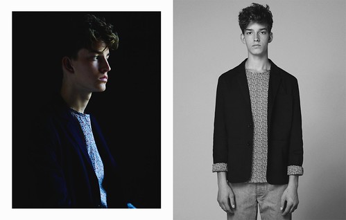
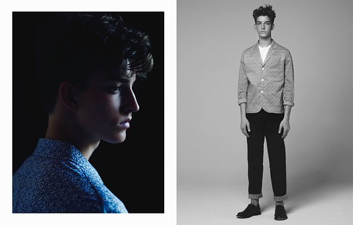
Designers have always been inspired by Liberty's ever growing archive of prints. Last year alone, the venerable department store launched a number of interesting collaborations, from affordable florals at Target to shoes by Repetto, Nike Dunks adorned with florals and luggage by Merci. With an archive that is one hundred and thirty five years old, there is plenty to excite and inspire. The latest to be inspired is b store. In an exciting collaboration, the design and textile forces behind two of our favourite stores have combined to create a truly covetable capsule collection that celebrates some of the finest prints on offer, including the much loved pepper print. Having recently breathed fresh life in to heritage label, Baracuta in a range of Harringtons and trousers, now b store have reimagined the use of florals in menswear. Here, while showcasing the Jason Hughes styled and Laurence Ellis shot look book, we talk to b store's very own Matthew Murphy to learn about his love of Liberty, discuss the retail landscape in the capital and find out how the Savile Row store will blow out ten candles in a series of events throughout the year...


SS: How did this collaboration with Liberty arise and how did it evolve in to the collection we see today?
Matthew Murphy: The project stemmed from our relationship with Stephen Ayres, Liberty's Menswear Buying Director. We have known Stephen since he worked at Selfridges and when he moved to Liberty he asked us whether we could work together on a project. As the store is in close vicinity with ours and with us working with Selfrigdes and our projects with Dover Street Market, central London is pretty covered in terms of stockists but we still wanted to create something together. We have always loved the heritage of Liberty fabrics and we can up with the idea of working on a capsule collection using these great fabrics. b store loves Liberty. It is not really a collaboration as such because of course, anyone can buy the fabrics wholesale but we wanted a special celebration of these great fabrics. We put the collection together and showed Stephen and he loved it. Initially, Liberty were going to stock it exclusively alongside us, but to get it manufactured we decided to do a bit more and the reaction internationally has been phenomenal. A number of stores that we have been working tentatively with were extremely positive. This season, with the collaborations with both Baracuta and Liberty, it feels decidedly British and the buying reaction has been great.

SS: Were the two collaborations strategically planned together or did they fall in to place?
Matthew Murphy: Ever since we started, the international opinion of b store has always been that we are a very London brand and people have always talked about it being very British. So, we planned that if we were going to collaborate we would work with British brands or brands that could really add something. Baracuta was a great one because we always found outerwear and casual jackets a difficult thing for us, we do shirts and trousers extremely well but tented to struggle with jackets. The stuff that they did with Watanabe and Margaret Howell was quite relevant to what we wanted to do so that came first. Then the Liberty opportunity arose and then everything just fell in to place. For future collaborations, we will continue down this route, find people will add to the complete look of the brand. We don't necessarily want to become a lifestyle as such but the aim is to offer a complete look. We obviously already do shoes and more recently accessories with Kuni (Awai), but it would be good to work on areas that we are not so prolific in and collaborate with specialists not so much in a craft way but, working with people on their signature items. I quite like the idea of working with brands that have become old, stuffy or slightly naff and tweaking them for the modern market.


SS: The archive of Liberty prints must be huge. What was starting point?
Matthew Murphy: We wanted a floral first and foremost because we were feeling that for the collection anyway which is why this always felt like a natural collaboration as they are known for their floral prints. Originally, we wanted to use some of the archive and heritage prints but it just wasn't possible in this instance. The archive prints are almost under lock and key, there are licensing agreements and cost issues so it is lengthy process. For the purposes of this happen, we wanted to make it as simple as possible but still used some amazing prints. It was the late sixties and early seventies prints that really inspired us. For example, the pepper print was designed in 1974/5 so there is still some history to them.

SS: This was a particularly iconic era for floral prints...
Matthew Murphy: Completely. Back then, what is great about them is that there is an obvious femininity there but when you put it in a shirt they feel masculine. There is such a soft feel to Liberty. As a store, it has always been my favourite department store in London. It was almost an introduction to menswear, back when I could first afford to designer clothes the menswear floor at Liberty was phenomenal. Back then they had a impressive Margaret Howell corner, a Westwood area, they had Dries (Van Noten), they were the first store to have Margiela. Fast forward to today and they have found a great niche. I think Stephen has a clear vision of what he wants the current menswear floor to be and it fits with our brand.


SS: You've had the pleasure of working alongside some of the great retail institutions of the capital...
Matthew Murphy: London is still one of the best shopping cities in the world. There might be more interesting things going on in other cities but if you want a selection then London is still the city. I'm all for teaming up and we've been fortunate to work with some great stores for example with Shop at Bluebird, with Selfridges, Dover Street Market and now Liberty. Each of the stores have strong identities and we've worked with all of them in different ways. It is amazing to think that our brand can do that, maybe the appeal is that it can fit so many different demographics and consumers. Originally, we thought that the work with Liberty would be a one off but after the success of it we began to think about working with the fabric in new ways and there is just so much creative opportunity. It can be subtle, as well as bold. For example, for SS12 we are already looking in to overdying fabrics. Then there are some bold geometric patterns from the 70s that remind me of early 90s Prada and that feels right at the moment as well. It is a great opportunity .

SS: What can you tell us about the planned launch?
Matthew Murphy: We are going to have a corner in Liberty's, put up the images and cover the walls in the pepper print. We are also going to open a pop up store in Printemps in Paris in May. Through doing this project, it has opened up opportunities. There are a million collaborations out there but if they are relevant then they work.


SS: I understand that 2011 is a big year for b store...
Matthew Murphy: It certainly is. We are ten in August and we have so many projects planned for the year to celebrate. Everything that we've planned is going under the umbrella of celebrating the store with different people, so Liberty, a roadshow with Selfridges which is pop up shop that begins in Manchester and goes to Birmingham before ending up in London, Printemps and we are working with Mr Porter online. We are also going to launch ten British products. We've approached ten British brands in categories that we are not currently involved in and these include lifestyle and fashion brands, some well known and a few which are less so. Actually there is one brand that I know you'll love, a new tie brand called Marwood. One of the key things that she does is using British lace on top of either silks or cottons to create ties and bow ties. It is beautiful. We are working with her for Spring/Summer in store but she is also going to be one of the ten. These types of projects are great because as well as keeping us creatively inspired, they are a great platform for discovering new brands and pushing them forward.

SS: In a sense, it is fitting celebration and it mirrors the core values of the b store ethos…
Matthew Murphy: Completely. It might be a bit less relevant or for difficult for us now in terms of menswear because our customers want a bit more consistency. For example, we have worked with Peter Jensen since the very beginning and we have customers who come to buy his designs, same with Stephan (Schneider) and now with Christophe (Lemaire). It is hard for us to introduce new menswear brands because there is no one we could nor would want to drop. Unfortunately we are governed by space and the fact that seventy per cent of our menswear is our own brand. This high percentage is not down to us pushing it but is down to the demand. So what we buy from these other bands is items that we wouldn't do necessarily ourselves by still feel very us, the understated luxury of Christophe or the geekyness of Peter. With these boxes filled it is difficult to bring on new labels. With regard to womenswear we have more freedom. This is why the Ten Products project is great because it allows us to bring in new names for product lines that we do not already sell.
-----

As the chaps celebrate their tenth anniversary in a style, you can expect to hear a lot more about b Store on the pages of this blog and beyond in the coming months. In the meantime, lets long for some sunshine and daydream about floral prints before the fruits of this collaboration hit stores next week.  

Thursday, December 16, 2010

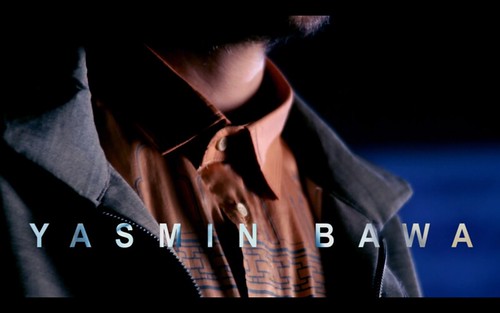
One for the future...Yasmin Bawa


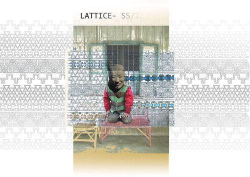
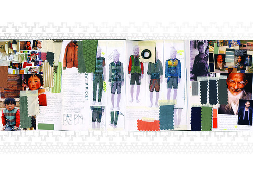
Yasmin Bawa is currently a Menswear student at Middlesex University who has sent through her pre-collection, entitled Lattice, for our viewing pleasure. This honours student has taken this opportunity to gather press, media and most importantly feedback on her design work. Bawa has found time to complete a seven look capsule collection and accompanying film. Along with the obvious creative talent it demonstrates she has the business nous to promote her debut offering through the blogosphere. We were surprised and excited when we opened the speculative email from the young talent and had to share it with you. In addition to the film and a selection of stills, the student has sent through a few scans of her research book.


Bawa looked to the hugely popular photography project Family Stuff by Huang Qingjun and Ma Hongjie for initial inspiration. If you are not familiar with the project, it documents the homes of fifty (and ever growing) rural Chinese homes, sees the family with all of their possessions taken from inside their house and placing it outside. The series shows the original artwork and furniture mixed in with modern appliances. Every facet of contemporary life in China is on display, including evidence of those that have changed and remained during this period of modernisation. Bawa's collection combines elements from these rural Chinese villages and the traditional lattice design artwork with a more technical element, showing the social change taking place as modern culture seeps its way into these homes and families.

Inspiration wall.

A look inside Bawa's sketchbook depicting lattice work, fabric swatches and inspirations.

Another look inside her sketchbook and assortment of inspirations for each look.

Chinese lattice work was a huge inspiration for the prints used throughout the collection.
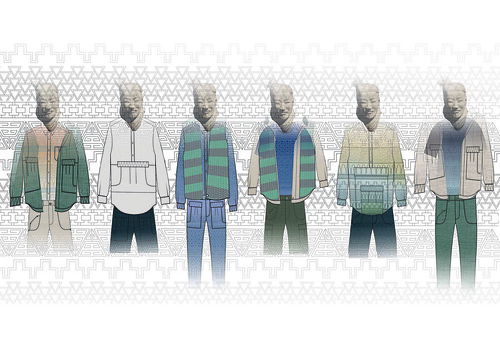
The seven looks sketched.

The battle between traditional and modern elements runs courses through the veins of the seven piece collection to beautiful effect. Natural fabrics, hand dying and screen prints echo the traditional element whilst laser etched prints on cotton drill and leather shows off the use of modern technology. Gradient effects on the fabrics add a further emphasis on the sense of change that is taking place all around the famlies depicted in the photography project, with one colour slowly taking over the next. As a menswear collection it showcases classic shapes whilst creating a whole new look with the colours, prints, function and detailing.

LATTICE Installation hand in

There are times when images just aren't enough. Thankfully, upon the completion of this capsule collection, Bawa soon decided to showcase her designs with a film by Liam Simpson. The design talent was inspired by Carolyn Massey's stunning SS11 film.
 

We think we'll be hearing a lot more from this creative talent in the near future. However, if you are impatient, you can follow the student's progress via her blog.

Friday, August 20, 2010

Style Stalking... Imelda Matt

You might think that the phrase 'style stalking' is an exaggeration, but this time you'd be wrong. Ever since we laid eyes on Imelda Matt in a gold suit we knew we just had to get him to do a style diary for us. After months (no, really) of chasing, cajoling and downright begging, he agreed. For those of you who don't know him (shame on you!), here's a little background: since unleashing Her Royal Highness Imelda the Despotic Queen of Shoes on an unsuspecting blogosphere more than four years ago, his sharp tongued take on the wonderful world of women's shoes has brought many a smile to our faces. It has been a firm favourite in our blogroll for as long as we can remember. More recently he launched the aesthetically pleasing Style Tyrant, a street style blog that focuses on the men of Melbourne. Just check out this guy if you need convincing!

Here's what Matt has to say for himself about his style diary:

Gurrl! Haz you been tokin’ on the crackpipe?” was the Despotic Queen/Style Tyrants response when Eliza asked if I’d consider doing a style diary!

Over the course of the last four years (during which time I’ve been blogging full-time) my bank balance and thus my wardrobe has been on life support.

Blame the GFC. Blame blogging. But for whatever reason, two and half years ago and in dire need of new threads, I started ‘shopping my wardrobe’, hence in lookin’ at my old rags?

But revisiting my purchases of yesteryear with older (albeit wiser) eyes has been a fascinating exercise. Aside for a few key pieces (Orri Henrrison and Subfusco) approximately 90% what I wear was bought during my 20’s.

Obviously, to accommodate my shifting taste my old rags have given a spit and polish. However, for as cash strapped blogger from the 3rd World I’m kinda impressed with how those early buys have stood the test of time.

These photographs are not a study of sartorial chicanery - what you see, is what you get!

The wait was well worth it though, we are absolutely delighted with the images. When the diary dropped in to our inbox the collective squeal of excitement deafened neighbours. No doubt this style diary will brighten up your weekend...

----------

Day One - Double Denim


Denim jacket is vintage JAG, Shirt from H&M, the jeans are ‘ready for the bin’ and shoes are vintage Hutton’s Playboy creepers

----------

Day Two - Subfusco


Entire outfit (including the Patrick Bateman vinyl blazer) from Subfusco, shoes by Pierre Hardy

----------

Day Three - Orri


Jacket and pants by Orri Henrisson, shirt from Saint Augustine Academy and boots picked up in Tokyo

----------

Day Four - Armani


Trousers are Giorgio Armani S/S 96, belt is Dolce & Gabanna circa 02, knit Arthur Gallan

----------

Day Five - Helmut


Jacket is Helmut Lang ‘98, trousers are Dolce & Gabanna S/S ‘97 and the shoes are by Max Kibardin

----------

Day Six - Gucci Belt


Gucci Belt – Jacket by Orri Hennrisson, vintage trousers, belt by Gucci S/S 97, shoes from Kenneth Cole and watch by Nixon

----------

Day Seven - Burberry


Pants from Burberry, Shirt by RESTERÖDS, Cardigan from Tiger House (Japan), Shoes from ZARA, vintage belt and rings by ATAT

----------

Wednesday, August 4, 2010

PETROU\MAN SS11

Almost a year to the day I first encountered the design work of Nicolas Petrou. The launch of PETROU\MAN deservedly received a fair bit of blog love (with Filep Motwary first out of the blocks) as folks were all excited to see the Cypriot designer turn his hand to menswear for SS10. The fanciful images he created for the look book which aim to represent elements of everyday life certainly capture the eye and the imagination. Inspired by men's active sportswear, the debut offering is a mix of patterns, mesh and is a reinterpretation of classic jackets and shirts. I quickly became a fan and was then fortunate enough to document his sophomore collection during New York Fashion Week back in February. I was able to witness first hand the designer's skill in creating a rich, unusual texture achieved through his combination of fabrics and prints. It also allowed opportunity to marvel at the intricate, hand finish detailing including hand dyed tartan suits and embroidered shirts and jackets celebrating the nomads much used tool; the humble safety pin. The collection confirmed that this exciting designer was one to watch and I for one was hooked.

Shots by Nicolas Petrou illustrating the mix of prints.

I have been itching to reveal his vision for SS11 ever since I first heard positive murmurings about it over on Selectism during their coverage of Capsule. Having caught sight of the super soft denim and attention grabbing madras, I was eager to see more and dropped Nicolas an email. Remarkably, he soon replied with a selection of iphone shot images that he snapped while showcasing the collection to buyers and press alike at one of the many US trade shows. This is the collection I've been crying out for all season. Now that most of the buying business has been carried out, Petrou and his team have shot a wonderful look book which I can happily share with you but first a few words from the designer himself on the key inspirations...

"As workwear and heritage lifestyle make way for vintage surf inspiration, Nicolas Petrou combines them all in one unique form with his spring/summer 2011 PETROU\MAN collection. Washed fabrics and hand sewn madras prints are combined with twill and high-tech touches to maximize garments’ breathability and sportswear fusion. Soft denim suiting, pleated trousers, and 50’s inspired tribal prints cut proportions in a manner that defies tradition."


Look book credits: Model: Lyle Lodwick (RED). Photography: Idris and Tony. Styling: Julie Ragolia. Hair & Grooming: Sylvia Dimaki.

The washed fabrics, soft denim tailoring, hand sewn madras and 50s inspired tribal cuts come together beautifully to create a collection to truly covet. Petrou is a designer who mixes fabrics and prints with great skill and his demonstration of craftsmanship never ceases to surprise me. Now, I have to confess that I have spent the last few weeks longing to press the fast forward button on this summer season as my wardrobe screams out for autumnal layering of rich fabrics. Somehow, this collection manages to force me to rethink my haste. I'd happily press pause on this season and live in a constant state of heat and sweat in the capital if I could cool myself off in one of these designs. The collection will of course be presented during NY Fashion Week for buyers and will be styled by Robbie Spencer once again. Having been treated to such a beautiful sneak preview of this PETROU/MAN collection, I'm looking forward to New York even more.

Tuesday, August 3, 2010

Leitmotiv SS11

If yesterday's post involved Peter Jensen grasping my cautious hand before leading me confidently in to the dazzling and uneasy world of prints, this one sees me getting slapped silly at the hands of Leitmotiv and their penchant for clashing and layering of the whimsical. You might recall that the creative duo behind the label first came to my attention at Pitti Uomo and I introduced their colourful designs soon after. What I didn't tell you in my initial post was how I acquainted myself with their designs. As you know, I was fortunate enough to find myself at the beautiful Jil Sander show which was held in the elaborate garden of a spectacular villa in the far hilly reaches of Florence. As much as I was blown away by the colourful march of Simons' models, my gaze was drawn to two men sitting just in front of me wearing the most attention grabbing all print ensembles. These two gentlemen were Fabio Sasso and and Juan Caro, the creative minds behind Leitmotiv and they were wearing two looks from their SS11 collection. Just over a month on and I can finally share their SS11 look book with you. Prepare to be dazzled like I was by the combinations of paisley, camouflage, polka dots and digital prints....


Of course these creations frighten this print cautious blogger but I like to be pushed from time to time. These Leitmotiv creations encompass both the ancient and the modern, all the while creating an eclectic, ironic, visionary array of designs. By looking to past centuries and different worlds, these prints provide a smile inducing collection. Sasso's passion for tailoring and constant Baroque thoughts combine with Caro's passion for art and all things Gothic. This fusion of these seemingly disparate styles create clothes and accessories that contain the most fantastic stories. The label is an artistic project with a bright and colourful language which frequently teeters on the edge of dreams and theater. It is a label that references art and fashion while showcasing great craftsmanship.

Monday, August 2, 2010

Picking Peter Jensen

Peter Jensen's signature bunny rabbit is a telltale sign of his quirky accessories and smile inducing touches that always accompany his collection.

Peter Jensen is one of those designers that I have often admired from afar but for one reason or another his designs have eluded my wardrobe. No longer. Over the weekend the designer opened his studio doors on Shacklewell Lane for a sample sale and this opportunity was too good to miss. Jensen's whimsical creations offer a Scandinavian approach to directional day wear that reaches out to the comical and the colourful in all of us. As soon as I entered the well organised sale space my eyes were drawn to the SS10 rail and a printed long sleeve shirt in particular...

A closer look at the silhouette scene

My apprehension towards prints in all of their myriad of forms is well documented on the blog, as is my desire to turn this sartorial uneasiness in to a gun ho approach of colours and designs. Who better to hold my cautious hand and confidently lead me through in to the world of prints than the playful London based Dane? This SS10 find evokes memories of my childish attempts to create paper cut portraits. Of course, my creations come along way short of this silhouette scene. Here, children play with balls, playful dogs excitedly pull on their leads, hatted gentleman confidently totter down the road. I'm not quite sure what imagined scene the print depicts but I'm quite sure that I would have there if I ever visited.
To ease myself in to the world of print I decided to layer the printed shirt under a simple navy cashmere sweater from M&S.

A close up of the collar detail. One quiet day I might name the characters...

The playful cuff.

Jensen has carved out a reputation as a designer whose impeccably produced creations thread together mischievous humour and a celebratory approach to individuality, with an impressive attention to detail and lightness of touch. This approach is clearly apparent in his designs for both men and women - the results of which always deftly remain on the wearable side of unconventional. His is a spirit which manages, seemingly effortlessly, to be simultaneously modern and timeless, fun yet rather clever, too. It is infectious. For me, this sample sale gem embodies everything that is wonderful about the designer.